Brand Guidelines
Visual identity system for Arclen. Dark-mode glassmorphism UI with burnt orange accent.
Logo
Wordmark


Logomark
 App icon
Torus (v4)
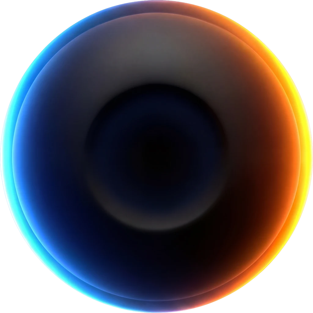 Hero size — 240px
Logo Rules
Color System
Primary Accent — Ember
Secondary Accent — Blue
Brand Gradients
Three purposeful gradients, each staying in one hue family. Warm and cool tell the brand story compositionally — ember elements next to blue elements — not by blending inside a single surface.
Surfaces
Arclen is dark-first but now supports light editorial passages on the homepage and marketing pages. Use dark surfaces for app/dashboard and hero moments; light surfaces for stat grids, comparison tables, and long-form editorial content.
#FFFFFF as the section canvas, #F7F7F8 as the page/table bg, #F3F3F5 for cards/stats that sit on top. Never flat white — always layered.Text
Semantic
Never Use
Typography
Usage Rules
Button Hierarchy
Use for: hero CTAs, "Start Scan", "Get Started"
Use for: "Learn More", "Work With Us", secondary actions
Brand Button System
Icon Buttons
Use GlassIconButton for icon-only actions: settings, search triggers, close, social links. Sizes 32 / 40 / 48 (default) / 56. Default and accent variants.
Never
Badges
Form Controls
Inputs
Toggles
Sliders
Progress Bars
Cards
GlassCard — interactive primitive with cursor-tracked spotlight, hover lift, and press scale. Use for clickable feature tiles. Four variants: default, ember accent, blue accent, and clear (see-through for overlays / rich-backdrop moments).
Get a complete conversion audit of your landing page with specific, actionable fixes.
Analyze your ad creatives against proven frameworks. Identify why ads underperform.
Describe what you want, AI builds it. Fine-tune with the visual editor.
Clear variant — minimal tint + lighter blur. Use when you want the backdrop to read through (overlays, cards on rich imagery, modals).
Brand Card & Effect System
GlassPanel Primitive
GlassOverlayCard Showpiece
Transforming technology to serve the people
ARCarclen.comTransforming technology to serve the people
ARCarclen.comLiquidGlassSwitcher
GlassFeatureCard
NeonGlassMenu
Effects
Noise Texture
Without noise
With noise (8%)
Shimmer Sweep
Continuous loop
Skeleton Loaders
Spacing & Radii
Spacing Scale
Border Radii
Critical Warnings
Composition Example — Score Card
Motion Path — Animated Tracks
Dark variant — ember dot on muted ember track.
Light variant — ember dot on near-black track for editorial / print surfaces.
Internal brand guidelines — do not distribute